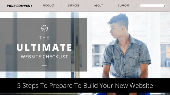
Website design is foreign to most small businesses.
That’s why so many of the self-made ones are so ineffective.
It’s also why so many small business owners are averse to spending to have one built.
When you don’t understand what you’re paying for it’s easy to feel uncertain about spending the money.
Today, I want to share some of the things you need to know and look for the next time your website gets a redesign.
These website design secrets will help your small business’ website do its job better.
Contents
Your Small Business’ Website Design Affects Your Search Success
Your small business website needs to be designed well in order to improve your search ranking through engagement.
Poorly designed websites detract from the user experience and result in shorter on-site times for visitors.
That reduced time leads to a lower search rank.
I think it’s important you understand that before we dig into anything here.
Most small business websites I come across are lacking the fundamental features that build engagement.
They’re poorly designed with little to keep their visitors engaged.
By taking your website design seriously, you can step ahead of most of your competition in search.
When You Understand Great Website Design You Know What To Focus On
As someone not familiar with web design, you might not know what parts of the website really matter.
You most certainly don’t know how they affect website visitors and how they convert.
That’s perfectly normal for anyone who isn’t in the web design business.
Today, I’m going to help you understand what you should be looking at and why it matters.
These seven items are the website design secrets you’ll need.
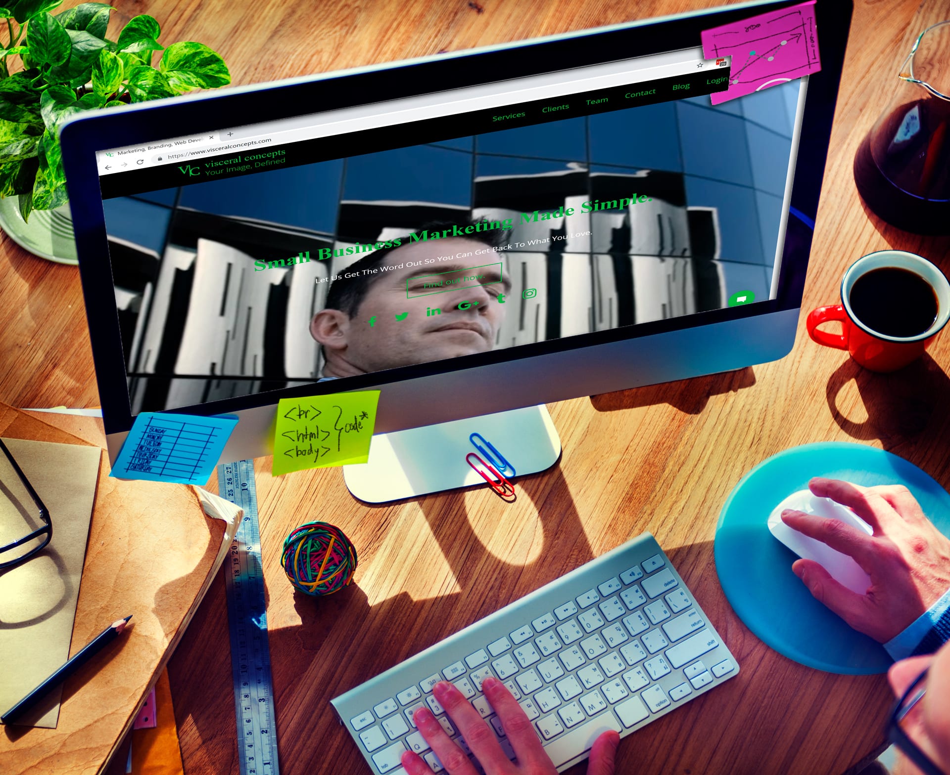
Your Website Design Visuals Need To Make An Impression
According to USC’s Annenberg School for Communication and Journalism, 63% of the population is made up of visual learners.
This shouldn’t be news to anyone.
Visuals have always been a huge part of marketing, sales, education, and just about every other kind of communication.
They are the most effective way to reach a large portion of any audience.
That’s why your website’s visuals are so important.
The colors and images you use on your website need to be eye-catching yet pleasing.
A website's visual appeal can help keep visitors engaged longer. Click To TweetThey need to captivate your audience’s attention, and they need to do it quickly.
As you plan out both your website design and your content, think about the way the visual makeup will affect your user experience.
Use images that draw attention, but make sure they add to or emphasize the message you want to communicate.
Your website layout needs to be visually-based as well, placing key elements in your audience’s natural line of sight.
Important elements should fill the “F” pattern of the site.
Eyes typically start in the upper-left corner, where you should place your logo.
Following the top line of the F from left to right, you need your navigation.
Additional navigation and important elements should be placed along the left vertical, with your call to action towards the end of the center line.
By keying your content into this visual journey, you put the important information where your audience needs to see it.
Your Website Design Must Be Mobile Or You’re Sunk
Back in 2012, Google decided that mobile search was important enough to optimize for.
They made a change to the algorithm that affected searches performed on mobile devices.
If your site wasn’t optimized for smaller devices (anything other than a desktop or laptop), your search rank is lower on mobile search.
For some, that doesn’t sound like a big deal.
However, approximately 60% of searches that Google processes are done from a mobile device.
Yes, that’s more than half.
With that many mobile searches, you can see why that penalty is a problem.
Google reports more than half of search is from mobile devices. Click To TweetSimply put, mobile optimization is now a requirement if you want to stay in business through the web.
That means quite a few significant details need to be worked out for your site to load properly on mobile.
- Make sure your images, content, and site sections (aka Main Content, Sidebars, Headers, and Footers) resize properly for all devices.
- Remove elements that won’t work on mobile devices (Flash elements, intrusive ads, etc).
- Reduce image file sizes and/or load lower-resolution images on mobile devices.
- Make sure large code elements load later that your content.
- Reduce your page load times as much as possible.
By focusing on mobile optimization, you improve your overall appearance in search.
That’s going to increase your site traffic a ton.
Your Website Design Benefits From Micro Interaction
Micro interaction is one of the most overlooked details of website design.
Great websites are full of micro-interactions, but you might not notice them unless you know what they are.
However, the site would be much less interesting without them.
That’s what makes them so great.
Micro-interactions are small visual design elements that signify that something has happened on a website.
These minor elements – usually animations – tell you that the object you’re interacting with does something.
As an example, let’s take the Facebook “thumbs up” animation.

We’re all familiar with this small animation that goes by every day with little fanfare.
However, without it the action of “liking” a post seems a little less enjoyable.
Micro-interactions make your site seem a little more human.
Everything from selecting a navigation item to adjusting a setting can have a micro-interaction.
Or, you can take it a step further and create a sort of game, as The Cool Club did.
These details make your site much more interesting, causing your visitors to stay longer.
However, it’s easy to get excited about making your website “cool”.
As a result, you can overdo the micro-interactions, which turns them into a distraction.
They should be used carefully and thoughtfully, like a good seasoning.
Before you create a micro-interaction, consider the following questions:
- Will this add to the user’s experience?
- How will this enhance the message you want to send?
- Does the interaction suit your brand identity?
By adding micro interactions well, you can keep visitors interested longer and improve your odds at creating a conversion.
Your Website Design Works Better With Simple Navigation
Navigation is one of the most critical elements of your website.
Designing it in an intuitive way makes your site simple to navigate and the information easy to find.
As a rule, all your information should be no more than 3-clicks away from your home page.
It’s been a long-standing, unofficial rule in website design.
Even though there is no evidence to support this rule, the basic philosophy it’s built on remains unchanged.
All your website’s information should be easy to find.
That’s where the importance of simple navigation plays a factor.
Making it easy to find the information on your site helps your visitors get to everything they need without frustration.
Your navigation shouldn't frustrate your visitors. Click To TweetA frustrated website visitor will never become a client.
Some general rules to follow when building your navigation:
- Include no more than 7 links in the main menu.
- Use dropdowns for related pages under one category.
- Keep the main menu links visible as opposed to a menu button.
- The logo should always take visitors back to the home page.
The most important thing about site navigation is removing the friction between user and website.
If you create a navigation menu that a 4th-grade student can use with ease, you’re all set.
Your Website Design Has To Focus On Your Call To Action
Consider the goal you have for every website visitor.
Your calls-to-action guide them down that path.
Scatter them in strategic locations around your website.
Remember that every visitor may land in a different spot on your website based on the search terms they use to get there.
They won’t always arrive on your homepage or on the product page.
You need to make sure your audience can get to the goal regardless of where they land.
The beauty of calls-to-action is that they can reflect different goals related to the page you use them on.
While some pages may target a purchase, others may be more suited for lead generation.
It’s important to recognize when to use each goal.
However, every page, regardless of the goal, needs a call-to-action in plain sight.
Let your website visitors know exactly what you want them to do next. Click To TweetCall-to-action placement can vary, but you need to design your website to direct your audience to it.
Some things to remember about your CTA and the website design around it:
- A/B test everything.
- Don’t use too many CTAs over small spaces as it confuses your visitor.
- Use text and images to point at CTAs that exist below the fold.
- Make sure your layout tells the story that guides your audience to your CTA.
- If you use more than one CTA, point it at the same target.
Everything about your website design should lead your audience to your call-to-action.
CTAs are designed to convert visitors to leads and customers.
That’s the main point to great website design.
Your Website Design Gets Better With White Space
In website design, white space is the open and unused space surrounding your website elements.
White space doesn’t literally have to be white.
When text, images, calls-to-action, and other website elements are positioned too close together, your website feels cluttered and confusing.
Open space between them makes things simpler to consume.
It also helps to balance the layout.
Solid, open-layout website design will improve the user experience.
That’s going to help reduce the bounce rate.
It’s another one of those things that you’d never notice until it got removed.
The biggest downside to whitespace is the desire to fill it.
Leave a little bit of empty space. Click To TweetAs you put together your website’s design, you might be tempted to try to use as much of the real estate as you can.
When you think like that, you start to see white space as an empty space that needs to be filled.
But the empty space is important to your site.
Some of the biggest benefits are:
- Increased legibility
- Higher interaction
- Better highlight those CTAs we talked about
- Cleaner is more impressive
- Clean separation between sections
With your site cleaned and highlighted by white space, you’ll start to see higher conversions.
That means the money you spent building it is worth it.
Your Website Design Requires Clean Typography
If I don’t discuss the impact of a font on your site, I’d be doing a disservice.
The font you choose is going to make that decision for you as much as anything else will.
I’ve seen lots of websites with terrible font choices.
Sometimes they’re so bad the content can’t be made out.
Your content must be legible.
There’s no point in creating it otherwise.
The other font factors that get in the way of legibility are font size and contrast.
Remember that the average person reading visiting your website is using a mobile device.
Read that as a small screen.
If they’re on a desktop they’re sitting around 20 inches away.
That means the 12pt font most websites use seems more like 9pt.
Bigger fonts make your site easy to read.
If your text is crap your visitors will leave. Period. Click To TweetA clear contrast also means the words are easy to make out.
That reduces strain on the eyes.
There are tons of other rules to fonts you ought to check out.
The main things you need to remember when choosing a font are:
- Use oversized headers. Don’t be afraid to go to 80pt.
- Large body fonts make your site easy to read. Anywhere from 16pt to 24pt is a good range.
- Keep the lines clean and the stroke width even.
- Allow some white space between the lines. Set your line-height to 1.5 times the font height.
- Watch how the font color plays against the background.
Adjust based on your own assessment.
Larger fonts may feel weird at first.
Keep making changes until it feels and looks right and easy to read.
If it’s easy for you, it’s likely easy for everyone.
Focus On These Seven Website Design Secrets For Your Small Business Website To Succeed
The next time you look at redesigning your website, these seven secrets are going to lead you to better SEO, more traffic, and better-quality leads.
Focus on the right elements and don’t waste any more time wondering why your website isn’t doing its job.